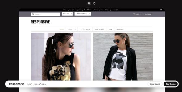
Responsive Shopify Theme is a powerful, versatile, and user-friendly Shopify theme built to help merchants create a professional online store with strong product visibility. Featuring customizable layouts, product galleries, promotional content blocks, and mobile-optimized design, it delivers a seamless shopping experience. It works particularly well for clothing brands, accessories shops, lifestyle stores, and modern ecommerce businesses.
If you’ve been working with Shopify for a while, you’ve probably heard of Responsive — it’s one of those themes that has built a reputation for being reliable, flexible, and built to last. And there’s a good reason for that. Responsive isn’t just another Shopify theme; it’s a complete storefront solution designed to give you full control over your store’s layout, branding, and shopping experience without needing custom development.
I first used Responsive on a project for a growing apparel brand that needed a professional-looking store but didn’t want something overly complex. They wanted flexibility, strong mobile performance, and easy customization. Responsive delivered exactly that. Using Shopify’s native editor, I was able to customize layouts, adjust typography, manage product grids, and create a clean storefront without touching code. It’s one of those themes that feels dependable right from the start.
What I really like about Responsive is how balanced it is. Some themes focus too much on flashy design, while others prioritize function but look outdated. Responsive manages to do both well. It’s flexible enough for beginners but powerful enough for developers, and it works great across a wide range of industries — from fashion and accessories to electronics and lifestyle brands.
 Try Theme
Responsive Shopify Theme Features
Let’s break down what makes Responsive such a popular and dependable choice among Shopify store owners.
1. Easy-to-Use Visual Customizer
The first thing you’ll notice is how easy Responsive is to customize. You can adjust layouts, edit sections, change images, and modify content directly inside Shopify’s editor. Everything is visual and intuitive, making store setup fast and straightforward.
2. Multiple Ready-to-Use Layout Styles
Responsive comes with several built-in style presets, each designed for different types of stores. You can choose a layout that fits your brand, import it, and quickly replace content with your own products and images. I’ve used this feature to launch stores much faster than building from scratch.
3. Clean and Conversion-Focused Product Pages
Product pages in Responsive are designed with clarity in mind. You get organized image galleries, product descriptions, clear add-to-cart buttons, and structured layouts that help customers focus on buying decisions.
4. Flexible Collection and Category Layouts
Responsive makes it easy to organize products into collections. You can create structured layouts, highlight featured items, and allow customers to browse efficiently. This is especially helpful for stores with growing inventories.
5. Built-In Homepage Sections
You can create dynamic homepages using built-in sections like featured collections, slideshows, promotions, and featured products. This makes it easy to highlight important items and guide visitors through your store.
6. Fully Responsive and Mobile-Optimized
As the name suggests, Responsive is built with mobile performance in mind. Layouts automatically adapt across desktop, tablet, and mobile devices. You can also fine-tune settings to ensure everything looks perfect on smaller screens.
7. Performance-Optimized Framework
Responsive is lightweight and optimized for speed. It avoids unnecessary scripts and works smoothly with Shopify’s built-in performance features. Stores built with Responsive load quickly and provide smooth browsing experiences.
8. Built-In Promotional Features
Responsive includes announcement bars, promotional banners, and featured product sections. You can run sales, highlight offers, and promote products without installing extra apps.
9. Global Design and Branding Controls
Fonts, colors, buttons, and layout styles can all be controlled globally. This makes it easy to maintain consistent branding and update your store’s appearance whenever needed.
10. Regular Updates and Reliable Support
Responsive has been actively maintained for years and continues to receive updates and improvements. Documentation is clear, and support is helpful, making it a dependable long-term choice.
My Experience
I’ve used Responsive for several Shopify stores, including fashion and accessory brands, and it consistently performs well. One project involved a clothing store that needed a clean, simple layout that customers could navigate easily. Responsive provided exactly that, with smooth browsing and clear product presentation.
Another project involved a growing lifestyle brand that needed flexibility as their catalog expanded. Responsive handled the growth without performance issues and made it easy for the client to manage their store independently.
What I appreciate most about Responsive is its reliability and flexibility. It doesn’t try to overwhelm you with unnecessary complexity, but it still provides enough control to build a professional, fully customized store.
Performance-wise, Responsive stores load quickly and remain stable, even as product catalogs grow.
Download Responsive Shopify Theme
We’re sharing Responsive Shopify Theme here for free for testing purposes only. You can explore its layouts, features, and customization options to see if it fits your store. If you love it and want full access with official updates and support, we highly recommend purchasing it directly from the developer.
Get the official Responsive Theme here: Buy Responsive
Last Updated on March 18, 2026 by admin